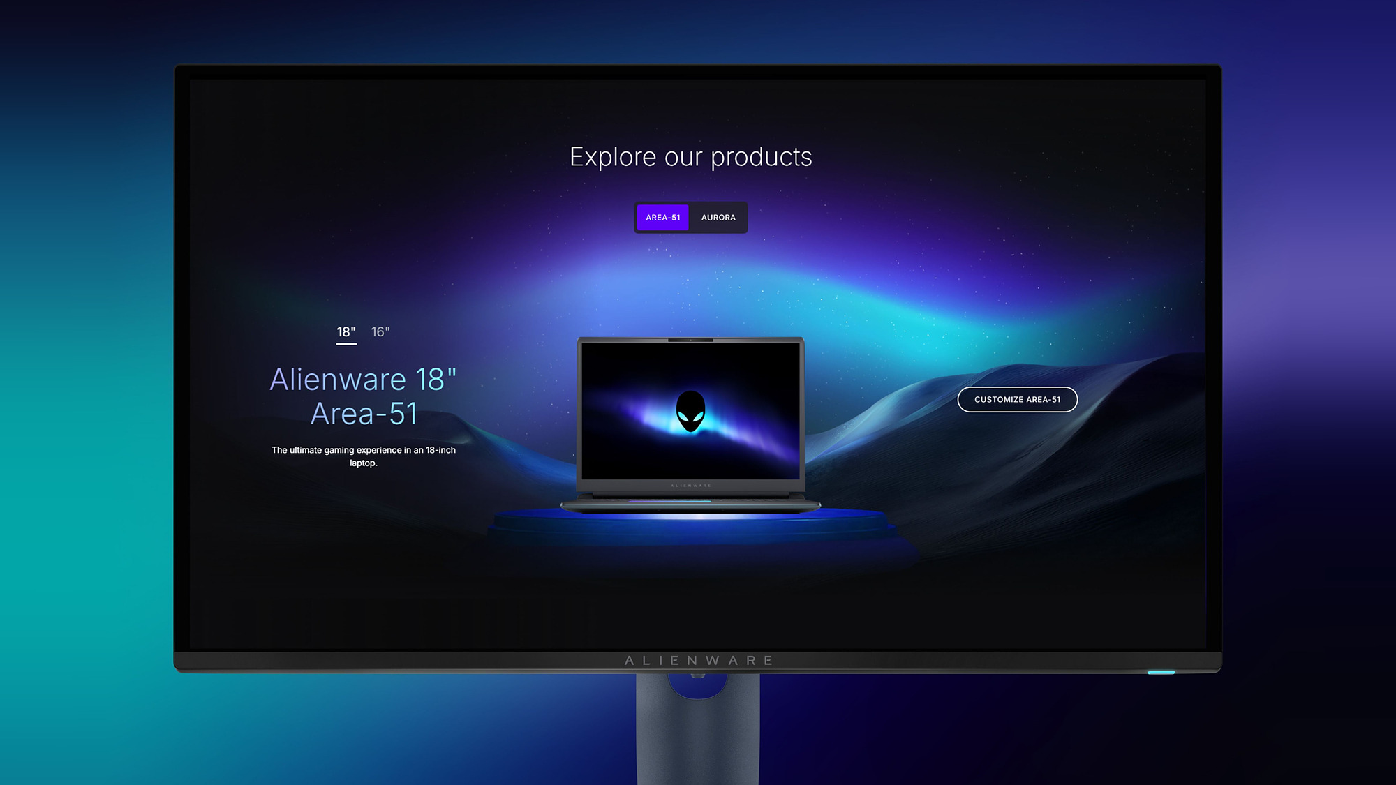
Alienware Learn Page - Phase 2
Rebuilding how gamers discover, learn about, and compare Alienware products
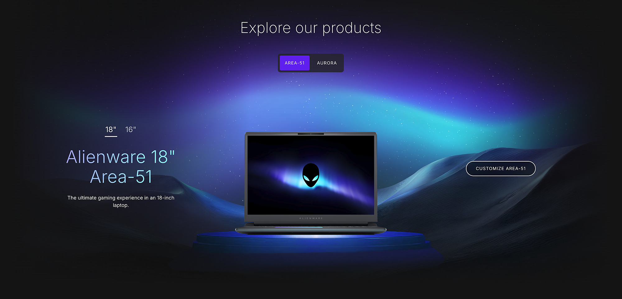
The Learn Page is Alienware's front door to an entire product family, the place someone lands before they've narrowed things down to a single model. It exists less to list specifications and more to give someone a sense of what owning an Alienware actually stands for, the world they'd be stepping into, not just the hardware itself.
Phase one did that well enough to earn its keep. But as more people came through, we started to notice a gap. The page was informative, but it wasn't quite resonant. So we set out to build what felt like its natural next step, something that still taught people what they needed to know, but finally felt like it belonged to the brand. That instinct is what grew into phase two.
Functional Wasn't the Bar
Phase one of the Learn Page was live and doing its job, but doing its job was never going to be enough for a brand like Alienware. The goal wasn't to fix something broken. It was to take a page that informed people and turn it into one that actually represented what owning an Alienware stands for, without losing the clarity that made phase one work in the first place.
That's a harder problem than a typical redesign. It's asking a page to carry more meaning without adding more friction, and to do it on top of an experience people already relied on.
Years in the Making
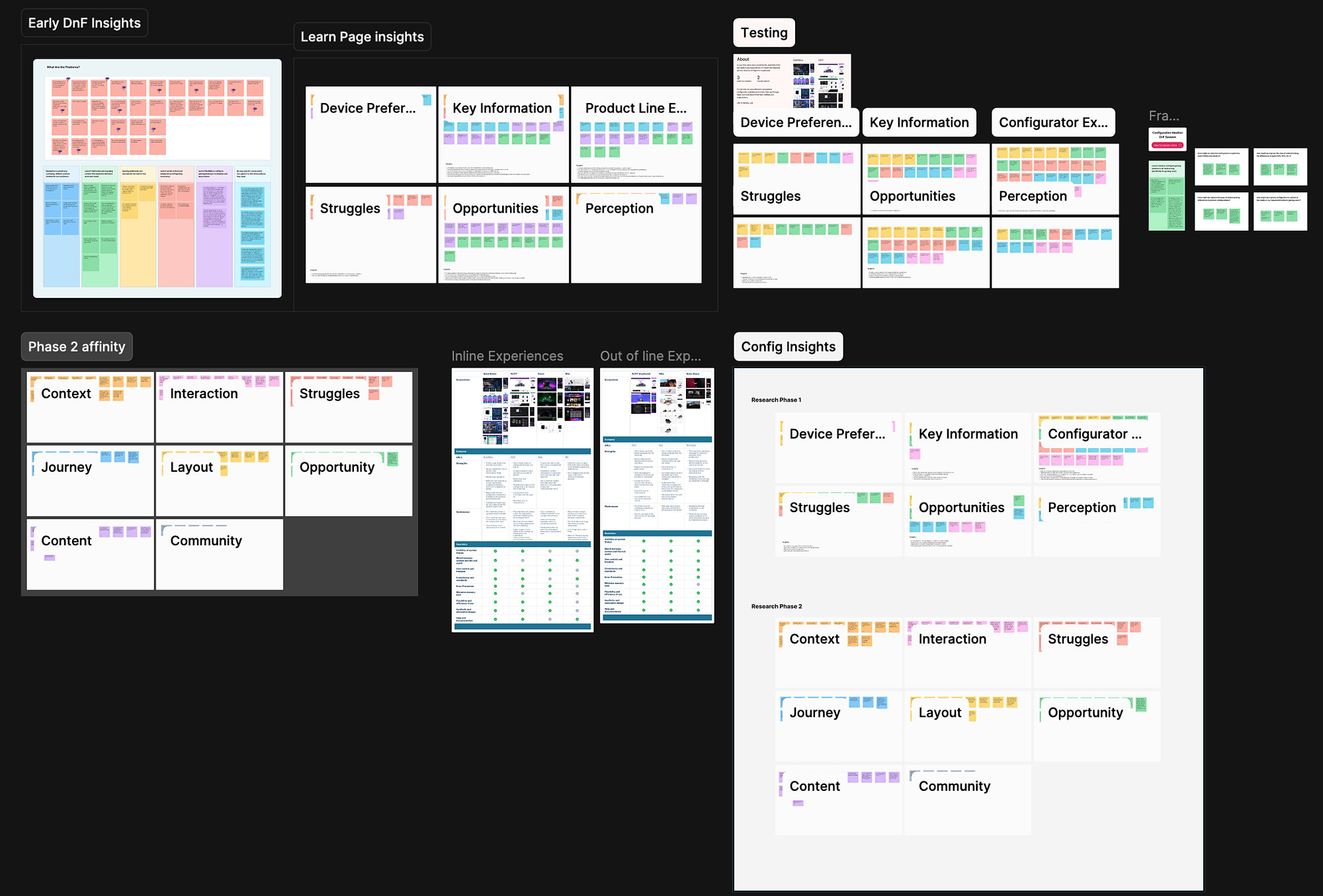
None of this started from zero. Alienware already had years of research behind this space, competitive analysis, and rounds of moderated and unmoderated interviews going back well before phase two began. I leaned on that existing base and layered fresh testing on top of it, rather than treating this like a blank page. Knowing what had already been learned well enough to build on it, instead of quietly repeating it, mattered as much as anything I did later in the process.
It's Not Just the Hardware
Two things shaped where this went. One came from a moment I'd have preferred to avoid. The other came from stepping back and asking what actually makes Alienware different in the first place.
The hard moment landed in late stage moderated testing, when a user told us the Compare Section completely broke the magic. It felt like a marketplace, not something built for gamers. That stung, because it had shipped for defensible reasons: backend limits and a tight timeline locked us into side by side product cards, a spec sheet with extra steps. But that one reaction told us comparison wasn't a minor detail. It was doing more work than we'd credited in shaping how premium the whole page felt.
The second insight came from zooming out. A Learn Page that only taught people about hardware was leaving out the part of the pitch that mattered most. What actually sets Alienware apart isn't the spec sheet, it's the community and the culture around owning one.
Explore the interactive prototype (opens in a new tab)
From Spec Sheet to Story
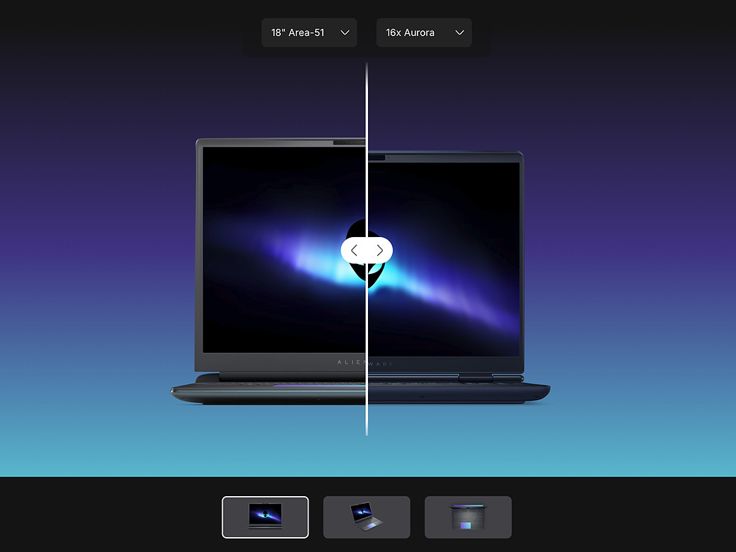
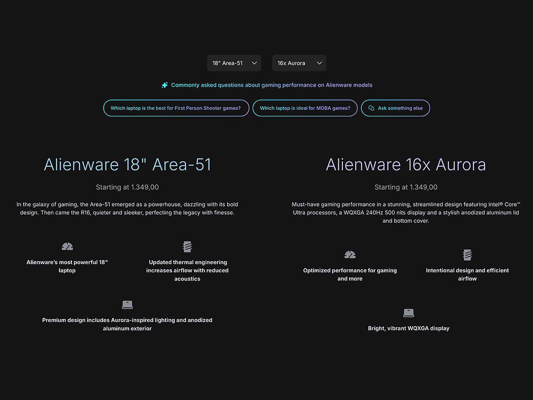
I helped redesign the Compare Section, moving it from static product cards to a visual, infographic driven comparison that let people choose what actually mattered to them instead of parsing a wall of specs. The goal was simple to state and harder to hit: make comparing feel like part of the experience, not a chore bolted onto the side of it.
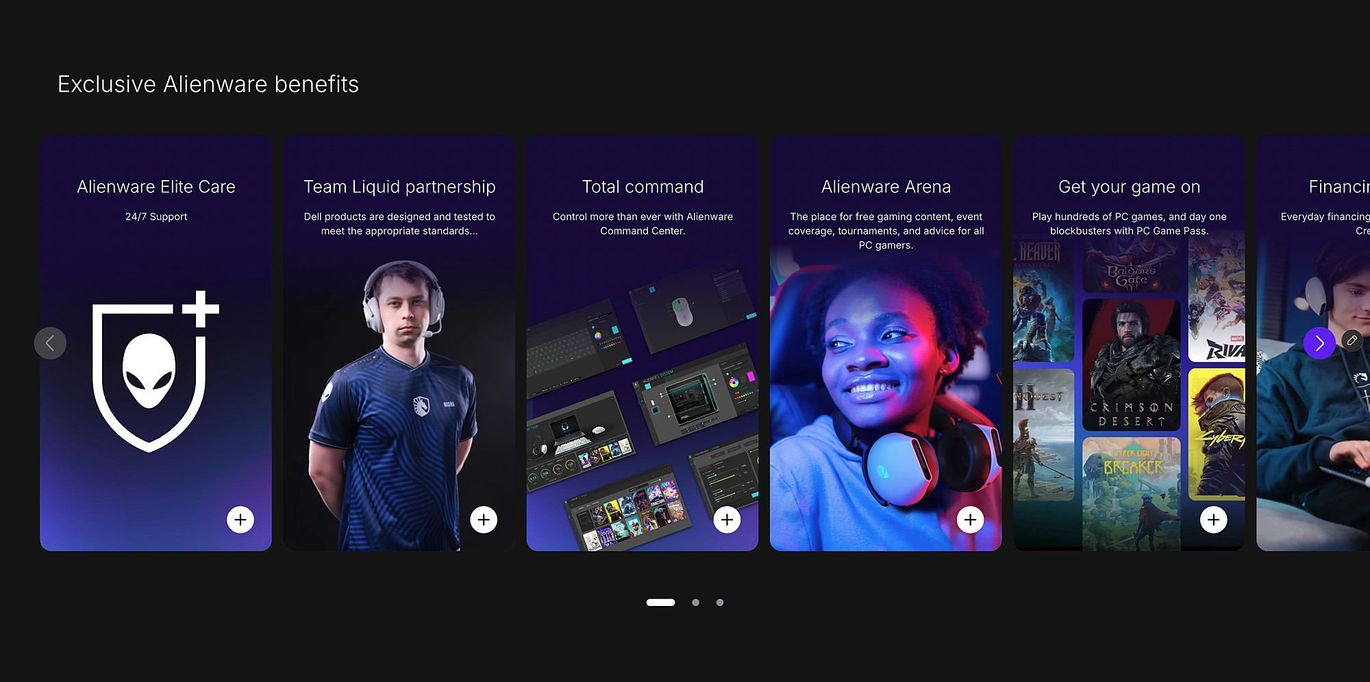
Alongside that, we built out the social layer of the page, bringing in content and reviews from Alienware's own pro team, Team Liquid, and the broader community benefits tied to Alienware Arena. That gave the page a way to show people what being part of the Alienware world actually looks like, instead of just telling them.
In later testing rounds, the Compare Section went from the most criticized part of the page to one of the most praised, the same feature, rebuilt around exactly what that one piece of hard feedback had been pointing at.
Where It Landed
The project was named a 2026 finalist at the UX Design Awards, in the Concept category, recognition for an experience that started from a hard piece of user feedback and turned it into one of its strongest features.

The Next Chapter
The vision for Alienware over the next five years is to lead the gaming market as the number one brand, built by deepening customer relationships and growing a community that actually shapes where the brand goes next. The Learn Page Phase 2 is one step toward that, proof that rethinking product discovery from the user's side can produce something genuinely better. From here, the plan is to keep iterating, add more features, bring in more AI, and eventually reimagine the rest of Alienware.com so every page feels this purposeful and distinctly Alienware.
What Carried It Through
The biggest lesson from this project wasn't about visual design at all. It was about what to do with feedback that stings. It would have been easy to treat that Compare Section comment as one frustrated user and defend a version we'd already justified to the business. Instead it became the starting point for the strongest part of the page.
The rest came from the team making calls together at every stage instead of in isolation. Fitting, maybe, for a page that was ultimately about showing people they were joining a community, not just buying a laptop.